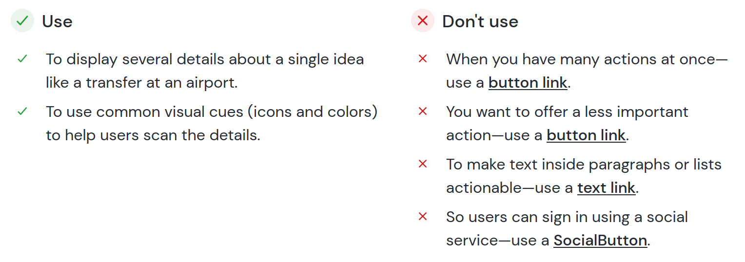
## Documenting a Design System ### Lessons learned from open sourcing the Orbit docs Aaron Collier --- ## About me  --- ## Design systems > allow ... users to build consistent digital experiences faster — Carbon by IBM Note: Building blocks to build consistently great experiences > helps us work together to build a great experience — Polaris by Spotify Note: Helps get multiple people on the same page, designing in the same direction. > avoid repeating work that’s already been done — GOV.UK Design System Note: Make sure your good decisions have broader impact. > ensure that everyone can contribute … with confidence — Pajamas by GitLab Note: Bring people into your project and help them. --- ## Orbit  Note: * Design system from Kiwi.com * For travel industry * Dedicated team * Recently put in list of [best design system documentation sites](https://backlight.dev/mastery/the-best-design-system-documentation-sites) --- ## What's included Orbit without documentation:     Note: Often starts as a component library/UI kit. We'd have component libraries for various platforms. A good building block to start with. --- ## What's needed * Standards 📋 * Patterns 🏁 * Processes 🔀 * Guidance 🦮 * Reasons for decisions 🧠 Note: Standards help ensure everything Patterns weave things together, they're ways to approach specific tasks. Processes help guide work collaboratively Include reasons so you don't have to repeat the discussions next year. All of this needs to be communicated: documented. --- ## Project needs * Had a WordPress site. * Didn't always live up to our own standards. * Far removed from code. * Hard to update: both content and format. * Wanted to be open source, like our React components. Note: That was what was on our minds as we began the project of building a new docs site. People contributing to the components had trouble contributing to the docs. --- ## Switch to  &  Note: That was what was on our minds as we began the project of building a new docs site. Gatsby is a JavaScript framework for building static sites. MDX lets you embed JS components in Markdown. Could use our own components in the site -- its layout and content --- ## Audience 👨🏻💻👩🎨👩🏽💻👨🏿🎨 🧑🏾💼🥷🏿🧑🏼💼🥷🏽 Note: First rule in creating documentation is to know who you are writing for. Designers and developers separately? Same person? What assumptions do they have? Can you write for all at once, or should you put code and design guidelines separately? --- ## Audience informs design  Note: These questions helped inform some of what we did. Like putting the API for React components on a separate tab, rather than the same page. And leading with examples that show the design and also allow you to play with the code. --- ## Provide structure <img src="./usage.png" alt="Showing when to use and when not to use a Button component" height="250px" /> See: [Documenting Components](https://medium.com/eightshapes-llc/documenting-components-9fe59b80c015) by Nathan Curtis Note: Once you know your audience, you should know something about their expectations. Help set and satisfy them with clear structure to component guidance. The article Documenting Components by Nathan Curtis is great on this, going through various tradeoffs for choices. The structure helps you provide enough information without it seeming to be overwhelming. Breaking it down into chunks makes it easier for people to find what they need. --- ## Our structure 1. Intro 1. Example 1. Usage (when to use/when not) 1. Status 1. Content structure 1. Behavior 1. Content 1. Look & feel Note: For Orbit, we settled on this structure. 1. Intro -- A short description of the purpose of the component 1. Example -- So people can get right to playing with the component and testing its API 1. Usage (when to use/when not) 1. Status -- Which libraries the component is ready in 1. Content structure -- What parts it has 1. Behavior -- Things like interactions, responsive behavior, and details on use cases 1. Content -- How to fill it in, what words to use such as advice on starting calls to action with a verb 1. Look & feel -- Varieties and especially design decisions to not argue over them again in 6 months --- ## Structure → templates ```markdown <ReactExample exampleId="Component-default" /> Start with an example: a basic case for the component. It should be simple enough to understand but still realistic. ## When to use - Put in use cases when this component should be used. - Use short fragments ("To achieve X goal"). ## When not to use - Briefly describes cases when this component should **_not_** be used. - Link to replacements---use an [other component name](/components/category/othercomponentname/). ``` Note: Once you have a structure, you can help people contribute by creating templates. These should include examples of the syntax and explanations for what to include. --- ## Make it easy to contribute <img src="/lint-errors.png" alt="Many linting errors for a pull request" height="500px" /> Note: The point of design system documentation is to guide contributors in the same direction. So make sure it's easy to contribute. It's nice to enforce style guidance through linters such as [Vale](https://docs.errata.ai/). But you want as few errors as possible. Otherwise, people are discouraged and don't contribute. This also applies to things like the process to get your docs site running locally. You want it as smooth as possible. --- ## Make it accessible  Note: This is one of the general principles of Orbit, but make sure your guidance is accessible to everyone. For example, don't rely on only color. If this was just red vs. green, many people wouldn't be able to tell which was which. We use shapes, structure, and aria labels to make it clearer. --- ## Add some flair <img src="/Orbit-guidelines.png" alt="A docs guidelines component in action" height="450px" /> See [Orbit MDX components in action](https://orbit.kiwi/mdx-examples/) and at the [source](https://github.com/kiwicom/orbit/blob/master/docs/src/pages/mdx-examples.mdx) Note: We created some components to make the docs more visually interesting. There's a secret page at Orbit.kiwi that shows all of them in action, which helps in visual testing and for contributors to see how they work. --- ## More than components <div style="display:flex"> <img src="/Figma-hierarchy.png" alt="The structure of files within Figma" width="500" /> <img src="/Figma-interactive.png" alt="An interactive guide to choosing the right layout component" width="500" /> </div> Note: Component docs alone aren't enough. We've documented processes, such as file organization in Figma. This helps make sure we're not duplicating work and people don't have to waste time on finding things. We also have patterns and other things that cut across components. Such as interactive decision trees to decide which component to use in which case. This helps narrows users focus down to designing or coding for their use case, rather than thinking about the system. The goal in each case is to get people to the work they want to do, using the design system as a helper, not a hindrance. --- ## Put it all together <div style="display:flex"> <img src="/Orbit-home.png" alt="Orbit docs homepage" width="500" /> <img src="/Orbit-component.png" alt="A Badge component in the Orbit docs" width="500" /> </div> Note: Individual component docs aren't enough. Use your design wizardry to make the entire experience --- ## Iterate <div style="display:flex; align-items:center; padding-left: 5vw;"> <img src="/badge-usage.png" alt="A Badge component in the Orbit docs" width="300" /> ⇒ <img src="/usage.png" alt="Orbit docs homepage" width="500" /> </div> Note: Gather feedback, see what works, and make it all better. --- ## Thanks to <div style="padding-left: 15vw;"> <div style="display:flex; align-items:center;"> <img style="margin-right: 0.5em;" src="https://orbit.kiwi/static/acf6fe77e21ee15fe896a2f17209f803/6ba37/will.png" alt="" width="60px" /> Will Kolmačka </div> <div style="display:flex; align-items:center;"> <img style="margin-right: 0.5em;" src="https://orbit.kiwi/static/a4ab49774841a0a2631560be19118988/fd013/milan.jpg" alt="" width="60px" /> Milan Seitler </div> <div style="display:flex; align-items:center;"> <img style="margin-right: 0.5em;" src="https://orbit.kiwi/static/e9b7ffd5b4562ddf7550f774d5071e11/89b9c/silvenon.jpg" alt="" width="60px" /> Matija Marohnić </div> <div style="display:flex; align-items:center;"> <img style="margin-right: 0.5em;" src="https://orbit.kiwi/static/ca01193dbf7d173e17d39366de23f6f3/83d6a/viktr.png" alt="" width="60px" /> Victor Genaev </div> <div style="display:flex; align-items:center;"> <img style="margin-right: 0.5em;" src="https://orbit.kiwi/static/839e7dbc35f4ad250b0275d5c3d38b5a/89b9c/vepor.jpg" alt="" width="60px" /> Luděk Vepřek </div> </div> --- ## Thank you Aaron Collier [collier.cz](https://collier.cz/) [aaron@collier.cz](mailto:aaron@collier.cz)